Our Terms & Conditions | Our Privacy Policy
Vizro is an open-source Python toolkit by McKinsey that makes it easy to build beautiful, production-ready data visualization apps. With just a few lines of configuration (via JSON, YAML, or Python dictionaries), you can create multi-page dashboards that would normally take thousands of lines of code.
Built on top of Plotly, Dash, and Pydantic, Vizro combines the flexibility of open source with in-built best practices for design and scalability. It’s quick to learn, customizable for advanced users, and powerful enough to move from prototype to production seamlessly.
In this tutorial, we’ll use the Vizro MCP server to create a dashboard directly from Claude Desktop.
Setting up the dependencies
uv package manager
To run the Vizro server, we will need the uv package manager. Install it with the following commands:
For Mac/Linux:
curl -LsSf | sh
For Windows:
powershell -ExecutionPolicy ByPass -c “irm | iex”
Once uv is downloaded, run the following command to get the location of uvx
For Mac/Linux:
For Windows:
Keep the location of uvx handy, we will need it for the config file for Claude
Claude Desktop
You can download Claude Desktop from Next, open the claude_desktop_config.json file located in the Claude installation directory using any text editor. If the file doesn’t exist, you can create it manually. Once opened, enter the following code:
Mac/Linux:
{
“mcpServers”: {
“vizro-mcp”: {
“command”: “/placeholder-path/uvx”,
“args”: [
“vizro-mcp”
]
}
}
}
Windows:
{
“mcpServers”: {
“vizro-mcp”: {
“command”: “placeholder-path//uvx”,
“args”: [
“vizro-mcp”
]
}
}
}
Replace the placeholder-path with the path of uvx
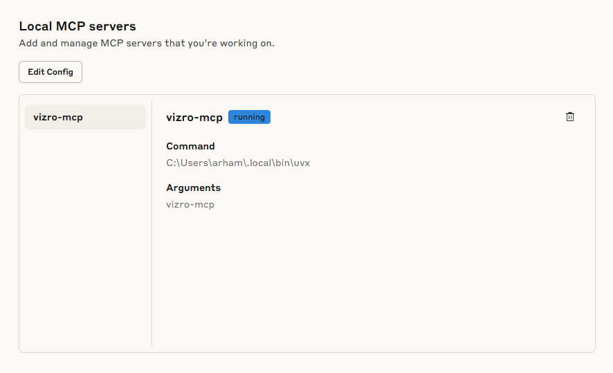
Running the Server
Once the file is configured, Vizro MCP Server should be visible in the list of servers.
Vizro comes with some sample datasets as well. You can try the following prompt to get started:
“create a vizro dashboard using tips dataset”
Claude will use the vizro-mcp to generate the dashboard and open it in your browser via PyCafe, showcasing interactive charts like tip vs total bill, average tips by day, tip distribution by gender, and tips by party size, along with filters for day, gender, and smoker status for seamless cross-filtering analysis.


I am a Civil Engineering Graduate (2022) from Jamia Millia Islamia, New Delhi, and I have a keen interest in Data Science, especially Neural Networks and their application in various areas.
Images are for reference only.Images and contents gathered automatic from google or 3rd party sources.All rights on the images and contents are with their legal original owners.
Aggregated From –
Comments are closed.