Our Terms & Conditions | Our Privacy Policy
YouTube Music has begun rolling out a redesigned media player interface for both Android and iOS devices. The update reflects Google’s broader effort to modernize the app’s appearance with a more minimalist layout and visual elements inspired by the Material 3 Expressive design language. Early reports of the redesign were highlighted by 9to5Google, showing a more refined playback screen with changes to button placement, queue management, and access to lyrics.
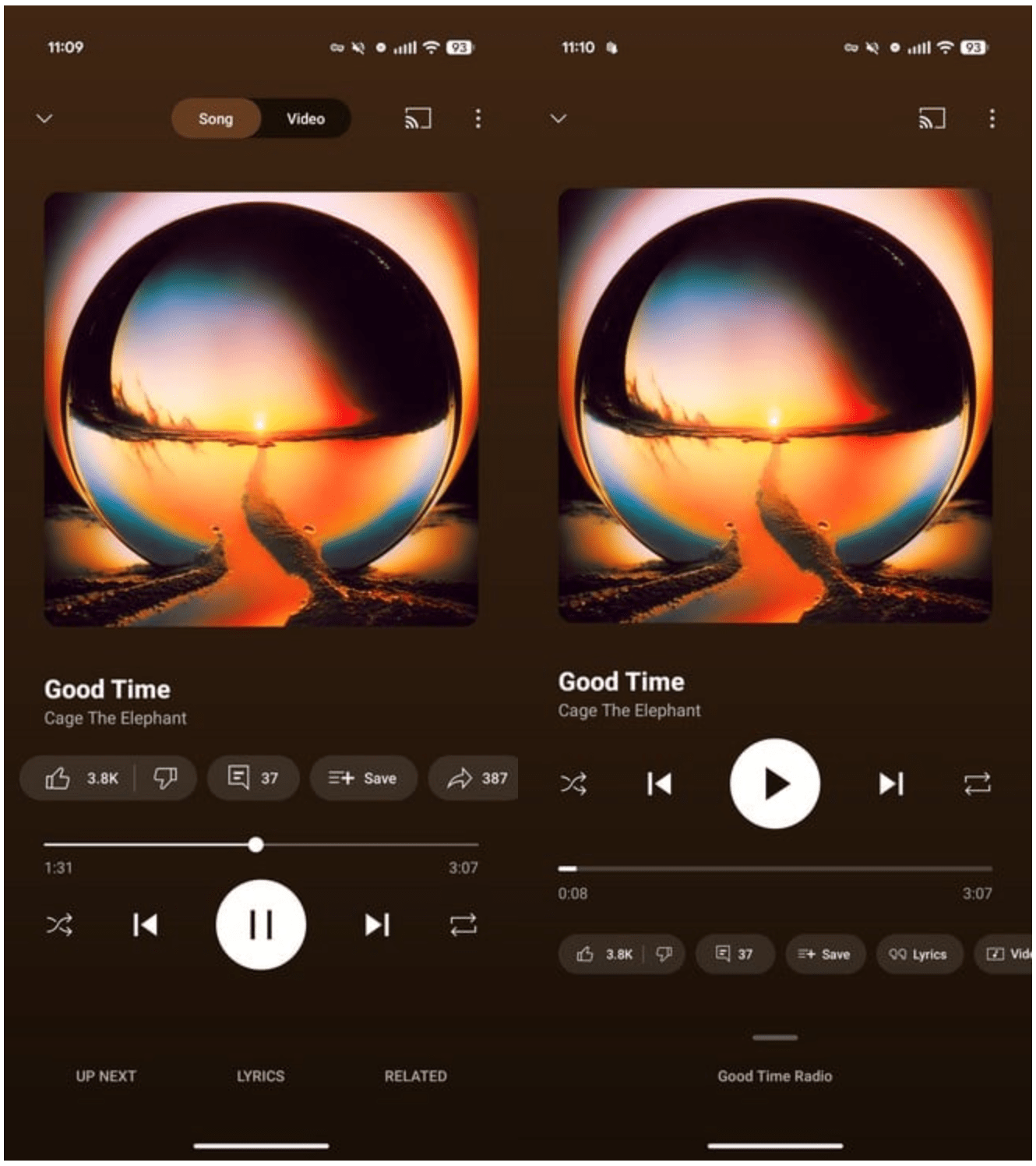
One of the most noticeable updates is the relocation of the music/video toggle. In the previous version, this switch was positioned at the top of the playback screen. With the redesign, it has been moved below the playback bar.
This bar has also been visually refreshed to follow the Material 3 Expressive style, becoming thicker and more prominent when tapped. Playback controls, which were formerly placed above the progress bar, now appear directly below it, creating a more consistent and streamlined look.
YouTube Music (old vs new interface). Image: 9to5Google
The bottom section of the screen has also been simplified. Instead of displaying multiple elements, it now focuses only on showing the title of the radio station currently playing or the list of upcoming tracks. This adjustment is in line with the overall goal of reducing visual clutter and giving the interface a cleaner appearance.
Another significant addition is a new split-screen playback mode. This feature allows users to access the playback queue in a more dynamic way. By dragging the radio or queue indicator from the bottom of the screen up to the halfway point, the queue becomes visible while the album artwork is reduced in size to fit both elements on the display.
If users prefer a more detailed view, they can either continue dragging the queue upward or tap on its name to expand it into a full-screen list. This flexible design makes it easier to browse and manage upcoming tracks without leaving the playback interface.

YouTube Music’s new inteface. iImage: 9to5Google
The treatment of lyrics and related content has also been updated. While these features remain available, they are now accessed through a dedicated button located beneath the playback progress bar. In addition, lyrics no longer appear with a transparent background. Instead, they are presented on a solid gray backdrop, which improves readability and creates a more uniform design.
The redesigned player is currently being distributed via a server-side update. This means that availability may vary depending on region and device, and it could take several weeks before the new interface becomes accessible to all users of the YouTube Music app.
Filed in Cellphones. Read more about YouTube Music.
Images are for reference only.Images and contents gathered automatic from google or 3rd party sources.All rights on the images and contents are with their legal original owners.
Aggregated From –
Comments are closed.