



Original Coverage & Source Attribution: hackernoon.com
I used to treat staking and DeFi dashboards like a bank rate board. A card said 8% or 40%, I compared the numbers, and I moved on. That habit broke the first time a high APY farm paid mostly in a thin reward token while the fee line under it was almost empty.
I’m a developer who builds visual market tools for crypto. I care about how people read on-chain data, not about promising returns. If you work on protocol UIs, analytics or you just stake and farm with your own capital, this is the method I use when a percentage on a screen feels too clean.
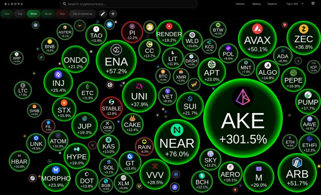
Disclosure: I work on Bloopa, a bubble-style market interface. That shapes how I think about relative size and volume. It does not change the checklist below, and nothing here is financial advice.
The APY on the Card Is Not One Thing
Every yield number has a source. If I cannot name the source in one sentence, I do not trust the rate.
Native proof-of-stake rewards come from issuance and, on some chains, a share of fees. Liquid staking wraps that stream behind a receipt token. Lending rates come from borrowers. AMM fees come from swap volume. Many farms mix a thin fee stream with a large emission of a governance token.
Those are different products. A 5% native rate paid in the asset I already wanted to hold is not the same object as a 25% farm paid in a token the market has to absorb every epoch. I write the source next to the rate before I compare two venues: “ETH issuance + priority fees, paid in ETH” versus “variable farm, paid in PROJECT.”
Put Rates on the Same Clock
Protocols advertise APY, APR or a per-epoch number as if they were interchangeable. They are not.
APR is a simple annualized rate. APY assumes compounding. Epoch rewards follow the chain’s schedule. Some liquid staking tokens grow by exchange rate instead of sending extra tokens into my wallet. If rewards sit unclaimed, they are not compounding. If a lockup blocks exit, the advertised APY is an upper bound, not a cash rate.
I convert everything to a simple annualized rate in the reward asset first. Compounding comes second, and only if it is automatic. That single conversion stops me from treating a daily-compounding liquid token and a monthly claim with a long unbonding queue as equals.
Subtract the Costs the Dashboard Leaves Off
Gross yield sells. Net yield is what I keep.
Operator or protocol fees come out of rewards. Gas to stake, claim, restake or exit can erase a small position. Slashing is rare on mature networks but still a real tail risk. Liquid staking tokens sometimes trade below the value of the underlying asset; that discount is a cost if I exit through the market. Lockups add opportunity cost when a better venue appears and I cannot move.
A one-line net is enough for comparison:
Net ≈ gross rewards − operator/protocol fee − expected gas − documented penalty haircut − persistent receipt-token discount.
I will not get a perfect forecast. I will get a number honest enough to rank two options. If the net collapses once fees and discounts are in, the headline was doing the work.
Prefer Streams That Survive When Emissions Stop
When rewards are paid in a farm token, supply growth can cancel the yield.
I check whether emissions are scheduled to fall, whether large unlocks sit ahead, and whether the same token is used as the reward across many pools. Fee-based yield behaves differently: it can continue after the printer slows, but only while volume stays. Incentive-heavy APY is a campaign. I can still take a campaign. I book it as temporary, not as run-rate income.
My filter is simple: can I still describe the reward stream after extra token emissions stop? If the answer depends on the printer, the position is a trade on incentive design.
Concentration Beats Headline TVL
Large TVL with a handful of depositors is not the same as large TVL with a wide set of wallets.
I look at explorer top holders, how much sits in a few contracts, and whether one wrapper holds most of the float. On the staking side, operator concentration matters: if a few node operators run most of the stake, downtime and governance influence cluster together. Concentration does not always mean “avoid.” It means an exit or an incident will not look like the average-case dashboard, so size has to reflect that.
Visual Size Catches Thin Markets Faster Than Tables
Tables hide relative scale. A mid-cap incentive token can look serious alone and small next to assets that actually clear volume.
I use a sizing pass before I trust any yield comparison. Is the reward token a liquid major, or is 24-hour volume thin against float? Is the base asset I provide as liquidity in the same league as the paired asset? A bubble-style market map makes that mismatch obvious in a way a sorted table does not. Relative market standing and volume do not prove a yield is safe. They show how painful an exit might be.
After the sizing pass I go back to the protocol docs and the contract. Visual context first, contract detail second, is a better order than the reverse. When the front end and the contract disagree on the rate, I stop.
A Weekly Pass That Fits in One Page
I do not need a data warehouse. I need the same five facts every week so the deltas mean something.
- Object: one protocol, one pool, or one asset — not all three in one sitting.
- Deposits in native units, not only USD (USD TVL can rise because a token inflated).
- What paid me: fees versus emissions.
- Concentration: rough top-holder or top-depositor share, plus operator set if staking.
- Exit path: instant, epoch, or unbonding queue — and any receipt-token discount.
I write one failure-mode sentence: “If X happens, I cannot exit quickly because Y.” If I cannot write that sentence, I do not understand the product yet.
What This Method Refuses to Do
It does not pick winners. It does not turn an APY into an expected dollar return. It does not treat TVL as quality. It does not assume a receipt token trades at peg. It does not use real yield as a brand name.
Staking and DeFi can lose principal through price, bugs, slashing or bad pool design. The only claim I stand behind is narrower: a yield figure is a starting input. Name the source, put rates on one clock, subtract costs, check concentration and look at relative market size. That is how a dashboard percentage stays useful after the banner changes.
If you build these UIs, surface fee vs emission split and exit path next to the APY. If you only use them, keep a one-page note. The loud rate is optional. The checklist is not.
Screenshot from Bloopa.net